Nashies
Brand Design & Package Design


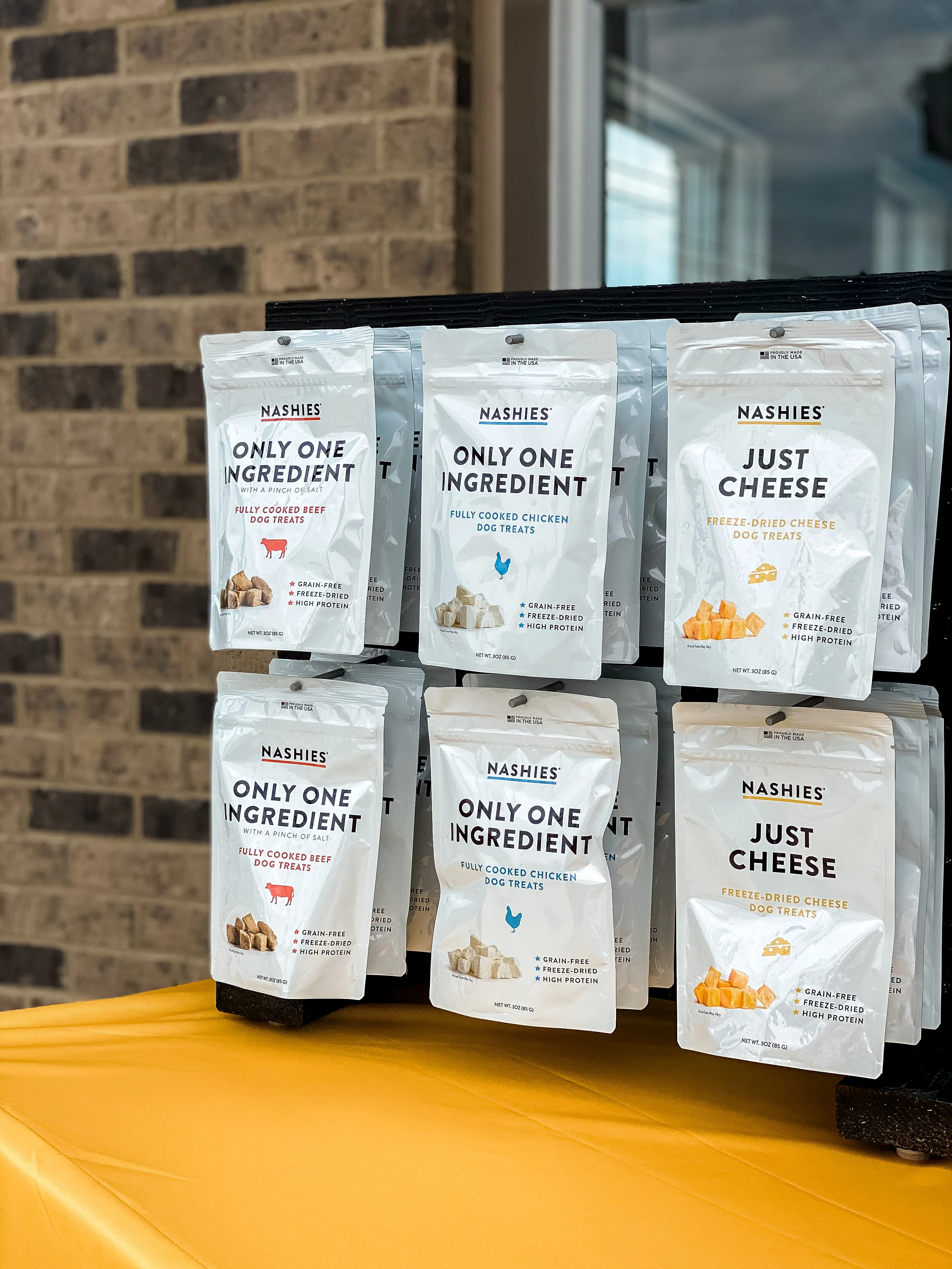
Working on Nashies
Nashies is not your typical dog treat company. Their sole reason for existence is to provide funding for the training and placement of therapy dogs in schools, hospitals and crisis situations. That’s why 100% of their profits go directly to these efforts, and that is why I was so excited to work with them.
Nashies are clean, one ingredient treats, and the Nashies team wanted their branding to reflect that. After many trips to pet stores, we discovered that treat packaging is very colorful, and a white package would pop on the shelves. So we knew that is exactly what our packaging would be; white with bold, clean, powerful typography. When working on the packaging, I had to think beyond the initial three flavors, and how the packaging could easily be updated as new flavors were introduced.